How to Design a Minimalist Cafe With Maximum Appeal
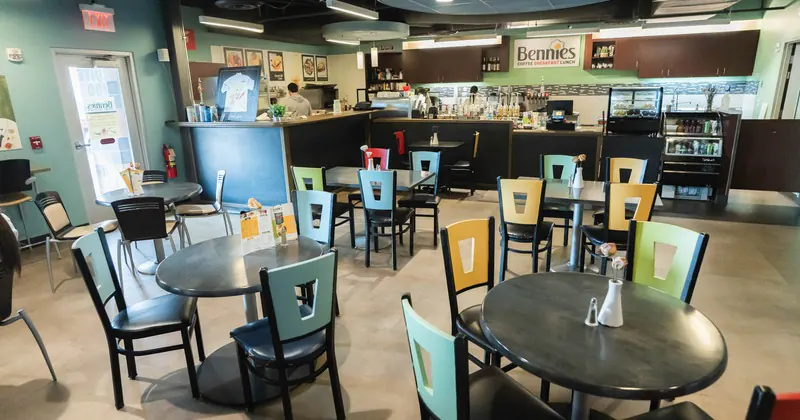
Minimalism has a reputation for being easy. Fewer materials, fewer colors, fewer objects, fewer decisions. In practice, designing a minimalist cafe is rarely simple. The restraint that makes a space feel calm also makes every choice more visible. A slightly awkward chair looks more awkward in a quiet room. A badly placed menu board becomes the visual center of the entire shop. Lighting that feels merely average in a layered, decorative interior can feel harsh and clinical in a stripped-back one.
That is why the best minimalist cafe spaces never feel empty, cheap, or unfinished. They feel edited. They feel intentional. They create relief from visual noise while still inviting people to stay, order another drink, and return next week with a friend. A good minimalist space does not ask customers to admire austerity. It makes them comfortable without calling attention to the work behind that comfort.
Designing that kind of cafe takes discipline. It also takes a clear understanding of what Cafe Bennies must do the heavy lifting once decoration is reduced. Layout matters more. Materials matter more. Light matters more. So do acoustics, traffic flow, maintenance, and the practical realities of service. If the room looks beautiful in photos but slows down the barista line, the design has failed. If it feels serene at 9 a.m. But echoing and stressful at noon, it has failed in a subtler way.
The most appealing minimalist cafes succeed because they remember a simple truth: people do not come back for blankness. They come back for atmosphere, ease, and a feeling that the place understands how they want to spend their time.
Minimalism begins with clarity, not emptiness
A minimalist interior should start with a clear point of view about how the cafe wants to function. Is it built for quick morning throughput, with a strong takeout business and limited dwell time? Is it neighborhood-driven, with customers who stay for an hour over coffee and pastries? Is it a hybrid space, active in the morning and slower, more social in the afternoon?
These questions matter because minimalism amplifies use patterns. In a cluttered interior, operational compromises can hide in the background. In a pared-down cafe, every queue, bottleneck, and awkward pause becomes more obvious. Before selecting finishes or sketching millwork, define how guests should move through the space, how staff should move behind the counter, and what emotional tone the room should create.
One of the most common mistakes is treating minimalism as a visual style first and a business environment second. That usually leads to fragile furniture, insufficient storage, poor signage, and a front counter that photographs beautifully but frustrates both staff and guests. A better approach is to think of minimalism as operational clarity made visible. The room should show people where to go, where to wait, where to sit, and where to order, without needing a dozen signs to explain itself.
When that clarity is present, the space feels calm even when it is busy. When it is absent, the room can look pristine and still feel tense.
The floor plan is the real design statement
In a minimalist cafe, layout does more for the customer experience than any decorative object. If you only have a few visual elements in the room, the arrangement of those elements becomes the story.
A strong layout usually separates three zones without making them feel rigid: arrival and ordering, waiting and pickup, and seating. The transitions between these zones should feel intuitive. Guests entering the door should not have to scan the entire room to understand what happens next. They should see the counter, understand where the line forms, and know where to stand once they have ordered.
This sounds basic, but it is often mishandled. In narrow cafe spaces, for example, owners sometimes push all seating to the front because it looks lively from the street. The result is a blocked entry, congestion near the door, and seated guests getting bumped by every person joining the queue. A better move is often to keep the immediate entry zone more open and let the room reveal itself gradually. Empty floor area near the entrance can feel luxurious in a small cafe because it creates breathing room and gives the design confidence.
Counter depth and back-bar planning deserve the same attention. Minimalism exposes clutter quickly, so if the counter has no dedicated homes for lids, bags, cups, retail items, and cleaning tools, the surface will never stay clean. Many cafes underestimate this. They design a sleek counter face in oak or microcement, then spend every shift covering it with utilitarian overflow. The answer is not stricter discipline from staff. The answer is better concealed storage.
I have seen compact cafes gain the appearance of being twice as organized simply by integrating under-counter compartments, slim ingredient drawers, and wall-mounted storage behind closed panels. Customers read that organization as quality, even if they never consciously identify why.
Restraint works best when materials have depth
When you remove pattern and decoration, materials have to provide character. This is where many minimalist cafe interiors drift into lifelessness. White walls, pale wood, concrete floor, black fixtures. On paper, that palette sounds sophisticated. In reality, if the textures are flat and the tones are poorly balanced, the result can feel like a waiting room rather than a hospitality space.
The strongest minimalist cafes rely on a small material palette with genuine tactile contrast. Warm timber against matte plaster. Honed stone with a soft, low-sheen finish. Hand-glazed tile used sparingly. Brushed metal rather than mirror-polished chrome. Linen or leather details where guests make contact. Even subtle variation matters. A room with only three materials can feel rich if each one has surface depth and honest texture.
There is also a practical side to this choice. Cafes endure hard wear. Chairs drag. Milk spills. Bags strike walls. Shoes grind in grit from the pavement. Some of the most photogenic minimalist finishes look tired within months of opening. Pure white grout near the service line, very soft natural wood on communal tables, unsealed porous surfaces around condiments, and delicate edge details all ask for a level of maintenance most operators cannot sustain.
That does not mean the space must feel heavy or overbuilt. It means durability should be built into the elegance. A lightly textured off-white wall often ages better than a stark white one. Mid-tone wood can hide wear more gracefully than pale ash. A stone-look porcelain floor may outperform natural stone in a high-volume cafe without sacrificing the quiet mood of the design.
Minimalism is not about using the fewest materials possible. It is about choosing materials that become more convincing the longer people live with them.
Light is what makes minimalist interiors feel expensive
If there is one element that consistently separates an average minimalist cafe from a memorable one, it is lighting. People tend to focus on furniture and finishes because they are easier to photograph and easier to specify. But light is what determines whether the room feels soft, flattering, and worth staying in.
Natural light is the ideal starting point. If the cafe has street-facing windows, preserve them. Do not crowd them with display clutter, oversized decals, or dense furniture. Let daylight penetrate the room. Even in a small footprint, a clear line of sight to daylight gives the interior a sense of generosity.
Artificial lighting then needs to support, not flatten, the architecture. Overhead lighting should rarely be the entire strategy. Uniform ceiling downlights often kill the mood in minimalist spaces because they make every surface equally important and reveal every imperfection. A better approach layers ambient, task, and focal lighting. The counter needs enough brightness for service and menu reading. Seating areas need warmth and softness. Shelves, wall textures, or a bench detail may deserve a quiet accent.
Warm color temperature usually serves cafes better than cool white light, though the exact balance depends on daylight levels and material tones. Around 2700K to 3000K often feels comfortable, especially in the evening. Too warm, and white finishes can look yellow. Too cool, and pastries, skin tones, and timber all suffer.
One practical note from real projects: dimming matters more than people expect. A cafe that opens at 7 a.m. And closes at 7 p.m. Experiences several different lighting conditions across the day. The room should be able to shift with them. A minimalist interior that feels poetic at sunset can feel overly dramatic or underlit during a gray morning rush if the lighting plan has no flexibility.
Minimal does not mean uncomfortable
A surprising number of minimalist cafes sacrifice comfort in the name of visual neatness. Thin-backed chairs, hard benches with no relief, tables spaced so tightly they feel transactional, or stools that look elegant for ten minutes and then punish anyone staying for longer than a short espresso.
Customers notice this, even when they cannot articulate it. They might say the place is beautiful but not somewhere they want to linger. For some business models, that may be intentional. But many operators accidentally design short-stay behavior into a concept that actually depends on repeat dwell time and secondary purchases.
Comfort comes from proportions and contact points. Table height should fit the seating style. Banquettes should have enough back angle to support the body without making dining awkward. Hard materials can still feel pleasant if edges are softened, seat depth is correct, and the posture they encourage matches the intended stay length.
A useful rule is to decide deliberately where the high-comfort seats go. Window benches, two-top tables along a wall, and a small number of lounge-adjacent seats can create the feeling that the cafe welcomes a range of uses without turning the whole room into a co-working zone. Not every seat needs the same message.
This is one of the subtle strengths of minimalist design. When the room is visually quiet, customers become more sensitive to proportion, spacing, and ergonomics. If those are handled well, the cafe feels generous. If not, the room feels stern.
Acoustics are the hidden factor most people miss
Minimalist interiors often struggle with sound because the same qualities that make them look clean also make them echo. Hard floors, smooth walls, glass fronts, sparse furnishing, and exposed ceilings all reflect noise. During a lull, that may not matter. During a lunch wave or weekend rush, it can turn the room into a bright, stressful chamber where every cup impact and shouted name bounces around.
Customers do not always say, "the acoustics are poor." They simply feel less at ease. Conversations become harder. Music competes with machine noise. Staff raise their voices. The energy tips from lively to tiring.
This can be solved without compromising the minimalist aesthetic. Upholstered banquette backs absorb more sound than people expect. Curtains or soft window treatments, if appropriate to the concept, can reduce glare and soften acoustics at once. Acoustic plaster, perforated wood panels, felt-backed upholstery, and strategic ceiling treatments can all work quietly in the background. Even the simple addition of books, product displays, or planted shelving can break up sound reflection if used sparingly.
One cafe fit-out I visited looked immaculate on opening day, all polished concrete, white walls, and oak surfaces. By the second weekend, customers were visibly shortening their stays because the room became exhausting once occupancy passed a certain point. The eventual fix was not dramatic. Upholstered wall panels were integrated into the banquette line, and suspended acoustic elements were painted to match the ceiling. The space looked nearly unchanged, yet the whole character of the room improved. That is the kind of intervention minimalist projects often need: small, precise, and almost invisible.
Branding should whisper, not disappear
Many owners worry that if they pare the space back too far, the cafe will lose its identity. That concern is valid. Minimalism is not a substitute for character. It simply asks character to appear through fewer, stronger signals.
A memorable cafe brand can live in scent, cups, uniforms, menu language, music, the rhythm of service, and one or two visual signatures. Maybe it is a beautifully proportioned pastry case. Maybe it is a custom pendant over the communal table. Maybe it is a very particular stone used only on the counter and nowhere else. Maybe it is the typography on the menu and takeaway packaging. These cues do not need to shout if they are consistent.
The danger is overcorrecting and making the brand invisible. A minimalist cafe still needs focal points. The guest should leave with at least one image in mind. If every surface is equally quiet and every decision equally neutral, the room can become forgettable.
Planting is a good example. Some minimalist cafes avoid it entirely because they want clean lines and low maintenance. Others use it carelessly as generic softening. The best approach is selective. One well-scaled plant near the window or a restrained branch arrangement at the right moment can add life and seasonality without turning the interior into a lifestyle set.
Service design is part of the aesthetic
A minimalist cafe only stays minimalist if daily operations support the look. This is where many beautifully designed spaces begin to unravel after opening. Delivery boxes have nowhere to go. Mobile order pickups collide with dine-in traffic. The pastry display becomes overcrowded. Extension cords appear. Cleaning supplies migrate into guest view. The elegant menu board is too small, so extra printouts start accumulating around the register.
These are not minor annoyances. They are signs that the design solved the image of a cafe rather than the reality of one.
A more durable approach is to plan from the most ordinary moments. Where do used trays land? Where do staff stage cups during peak periods? How are bags stored? Where does the water station sit so that people refilling bottles do not block pickup? Can a guest with a stroller or wheelchair move comfortably through the room? Can the queue expand without overwhelming seated guests?
The strongest minimalist projects answer those questions early. They often include elements customers barely notice, such as hidden waste stations, integrated cable management, recessed condiment niches, and counter returns that subtly shape the line. None of that sounds glamorous. All of it protects the visual calm that minimalism depends on.
Where to spend and where to hold back
Minimalist cafes often tempt owners into spending heavily on visible finishes while underinvesting in infrastructure. It is usually wiser to reverse that instinct. Good lighting control, quality joinery, durable flooring, acoustic treatment, and a well-planned counter are worth more than a long list of decorative purchases.
The areas that typically deserve the strongest investment are these:
- The counter and back-bar, because they shape both service and first impressions
- Seating that customers actually want to use, because comfort drives dwell time and repeat visits
- Lighting and dimming, because they control mood more than almost any finish
- Storage and concealment, because clutter destroys minimalist interiors faster than anything else
- Acoustics, because comfort is not only visual
Savings can often come from reducing unnecessary variety. Fewer finish changes mean simpler installation and a calmer result. Repeating one chair model through most of the space may work better than mixing several mediocre options. Standard tile used thoughtfully can look better than expensive stone used too widely. A restrained palette is not only an aesthetic decision, it is also a budgeting tool.
Small spaces often benefit most from minimalism
Minimalism is particularly effective in compact cafe footprints because it can create the perception of order and spaciousness where square footage is limited. The trick is not to empty the room. It is to remove friction.
That might mean wall-mounted seating along one edge, a narrower but more efficient service counter, or custom communal tables that reduce dead circulation gaps. It might mean using mirrors carefully, not as a gimmick but to extend light and visual depth. It often means integrating storage vertically so the floor plane stays clean.
Color can help more than people expect. A small minimalist cafe does not have to be all white to feel open. Soft mineral tones, warm grays, clay neutrals, muted greens, or light timber can create a more grounded atmosphere while still preserving brightness. In fact, very small all-white rooms can sometimes feel more cramped because every mark, shadow, and contrast reads strongly.
One neighborhood cafe I remember well had less than 500 square feet for guest space. Instead of forcing too many tables into it, the owner accepted a lower seat count and focused on excellent standing flow, a calm counter, and a built-in bench under the front window. The room always looked composed, even at busy times, and the reduced visual stress made the space feel more generous than larger competitors nearby.
Editing is what creates appeal
The final stage of designing a minimalist cafe is not adding, it is removing. Not removing function, but removing hesitation. If an object does not have a job, question it. If a material appears only once without a reason, question it. If signage is compensating for poor layout, redesign the layout. If a beautiful shelf becomes a storage problem waiting to happen, simplify it before opening day.
Editing should happen at multiple scales. At the room level, reduce distractions so the essential gestures stand out. At the furniture level, simplify profiles and align details. At the operational level, cut anything that creates visual overflow. At the branding level, identify the few cues people will actually remember.
The irony of minimalist design is that it often feels more generous when less is competing for attention. Customers notice the morning light on the wall, the quality of the ceramic cup, the ease of finding a seat, the space between tables, the quiet confidence of the counter. Those are not empty experiences. They are precisely what make a cafe appealing.
A minimalist cafe with maximum appeal does not chase starkness. It balances warmth with order, restraint with hospitality, and beauty with the daily reality of service. When it is done well, the room feels inevitable, as if nothing could be added and nothing important has been left out. That is the sweet spot every minimalist cafe should aim for.
Bennies Cafe
17230 Jackson Creek Pkwy Ste 100, Monument, CO 80132
+1 719-445-0660
FAQ About Cafe
What is considered a café?
A café is generally an informal place to enjoy refreshments and a meal. Bennies Cafe in Monument serves breakfast and lunch in a counter-service setting, with options including eggs Benedict, sandwiches and crepes. Guests can eat in or arrange pickup.
What is the difference between a coffee shop and a café?
The terms often overlap. A coffee shop usually emphasizes coffee and other drinks, while a café may offer a broader food menu. Check the individual establishment's menu rather than relying on its name. Bennies Cafe offers coffee drinks alongside breakfast and lunch dishes.
What is the difference between café and coffee?
In everyday English, a café is a place where people buy food and drinks, while coffee is the beverage. The word café comes from the French word for coffee. Bennies Cafe serves options such as brewed coffee, espresso and lattes as part of its drinks menu.